
Overview
The Brief
"We would like to improve our app and make it more user-friendly and engaging. We want to make sure that our users are getting the most out of our app and that they are happy with it, they use the app every day to be safe, and we would like to explore how we can monetize."
Beloo is a cycling safety app that broadcasts a rider's live position to contacts, provides incident alerts, and integrates roadside insurance. I was brought on as a Collaborator UX Designer to identify why daily usage was low, diagnose the existing UX debt, and design systems to fix it.
The engagement unfolded in four phases: a full heuristic audit, generative user research, hands-on user testing with real cyclists, and an end-to-end redesign covering interaction patterns, information architecture, and the complete UI.
Phase 01 — Audit & Heuristic Review
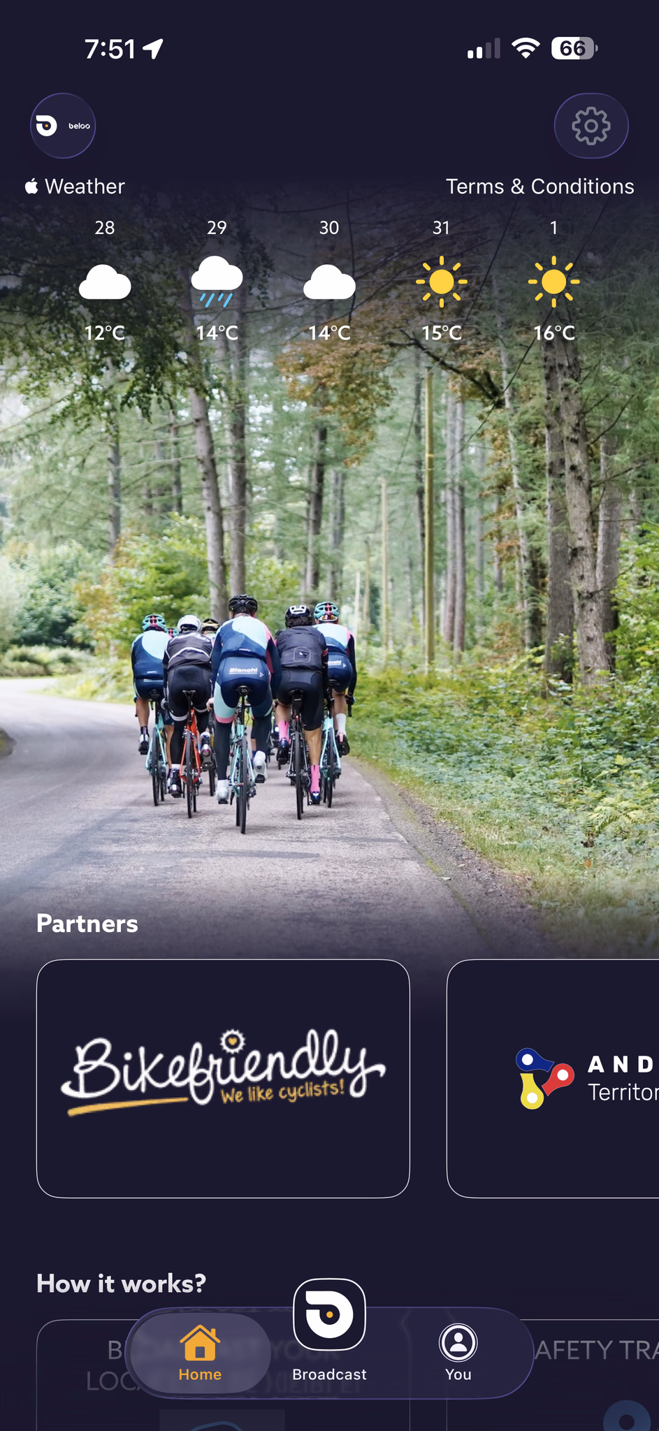
The Problem
The initial phase focused on identifying the app's existing issues so the client could understand them and take actionable steps. The audit was conducted across three tracks.
Preliminary Analysis — A comprehensive review of heuristics, usage patterns, accessibility, CRO, usability, branding, colorimetry, performance, user retention, daily usage, user product perception, monetization, and business strategy. Key friction points:
- Emotional disconnect — Lack of emotional connection with the user and visual warmth.
- Inverted visual hierarchy — Cluttered, distracting interface with unclear priority.
- Navigation issues — Unintuitive nav bar, no main CTA, unclear action feedback.
- Accessibility failures — Contrast issues, especially critical on the home screen.
- Information Architecture gaps — Wrong content order, no quick access to core features.
- Brand inconsistencies — Visual and brand inconsistencies throughout.
- Suboptimal monetization — Poor perceived value and unclear premium tier messaging.
- Poor sensory experience — Overuse of high-contrast yellows and oranges without functional purpose.
Phase 02 — User testing & Research
Understanding the Cyclist
Initial generative research was conducted to align with cyclists' mental models — ranging from professional athletes to casual riders. The goal was to map core pain points, safety concerns, and the incentives needed to integrate the app into daily riding routines. Understanding the "why" behind their interactions was the only way to address the gap between functionality and perceived value.
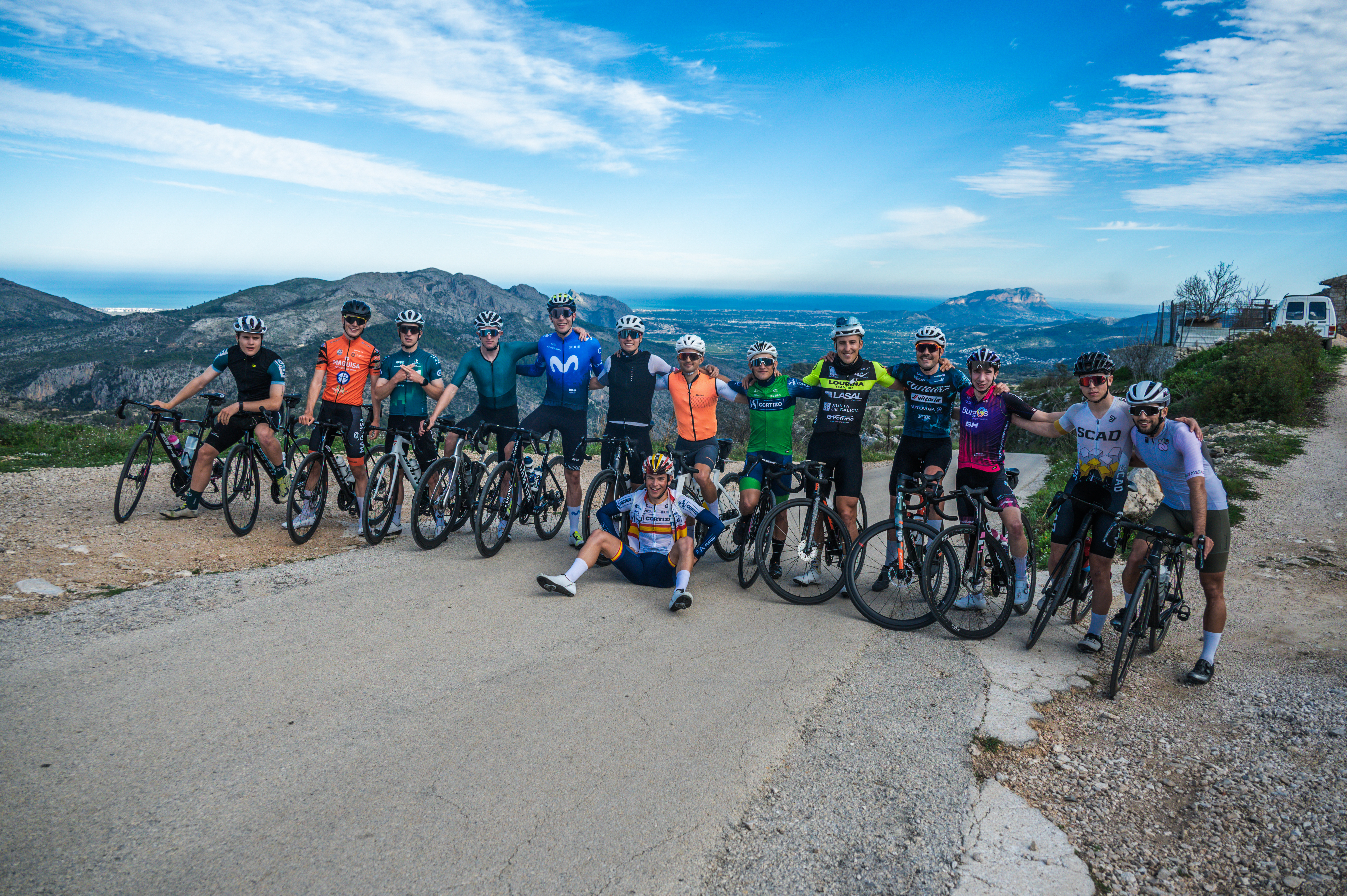
User Testing in Calpe, Spain — To validate assumptions, a group of professional and casual riders was recruited to test the app during a training camp in Calpe, Spain — including Spanish champion Ivan Romeo. Different rider profiles were deliberately selected to cover the widest range of cyclist users. Participants used the application daily, reported their experiences, and attempted specific tracking tasks. After a week of continuous use, in-depth interviews and a Typeform survey were conducted, followed by a focus group.
Primary findings
- Low Daily Retention — Users frequently forgot to open the app and struggled to perceive its utility beyond basic safety features.
- Unclear System Feedback — Features felt confusing and lacked tangible value. Participants repeatedly requested integrations with third-party apps and easier access to core tools.
- Confusing Information Architecture — Users lacked a clear understanding of the app's primary goals and layout, particularly the home screen. A common request: merge the home screen directly into the active tracking screen.
- Colorimetry and Visual Stress — Riders reported contrast issues and sensory stress caused by an overuse of bright yellow and orange without clear functional purpose.
- Usability in the Field — Difficulty accessing the tracking panel while wearing gloves, too many taps to reach core features, no device integration.
- Feature Comprehension — The majority of users didn't understand the 112 button, the incident button, or the roadside insurance — it effectively felt non-existent.
Phase 03 — Design
The Redesign
Addressing the user pain points and following extensive research, several solutions were crafted to boost daily usage through incentives, quick access, reminders, and hardware integration.
Feature — Retention
Intelligent Notification & Reminder System
Notifications are one of the most powerful drivers of daily app engagement. For Beloo, they're critical — users forgot the app existed between rides. The solution: a context-aware system that learns from each rider's history and sends reminders at exactly the right moment.
-
Smart ride timing — Analyses the user's historical ride data to identify peak usage hours and sends a reminder just before that window opens.
-
Movement detection — If the phone detects 15 min of movement at 21–37 km/h (average cycling speed) without the app active, it sends a prompt to enable tracking.
-
Social proximity — Notifies the user when a friend or contact is cycling nearby.
-
Inactivity nudges — After extended periods of no app use, sends a motivational re-engagement message.
-
Morning motivation — On each user's most common riding days, sends a personalised morning message to build the habit loop.
Feature — Quick Access
Shortcuts & Widgets
Starting a ride should take one tap — not five. Quick access controls were designed for the Always On Display, iOS Control Center, Android Quick Settings panel, and home screen widgets, so Beloo is always one gesture away.
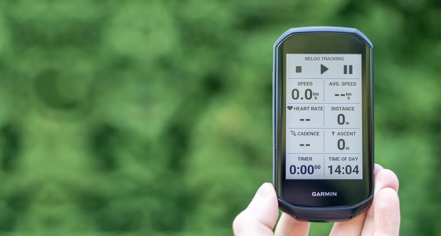
Users ask for this feauteres and I research about the standards and solutions of the industry. Plus, other complementary solutions are integrations with other platforms and devices: strava sync, training peaks sync, suunto sync, smart-watches and Garmin Edge.
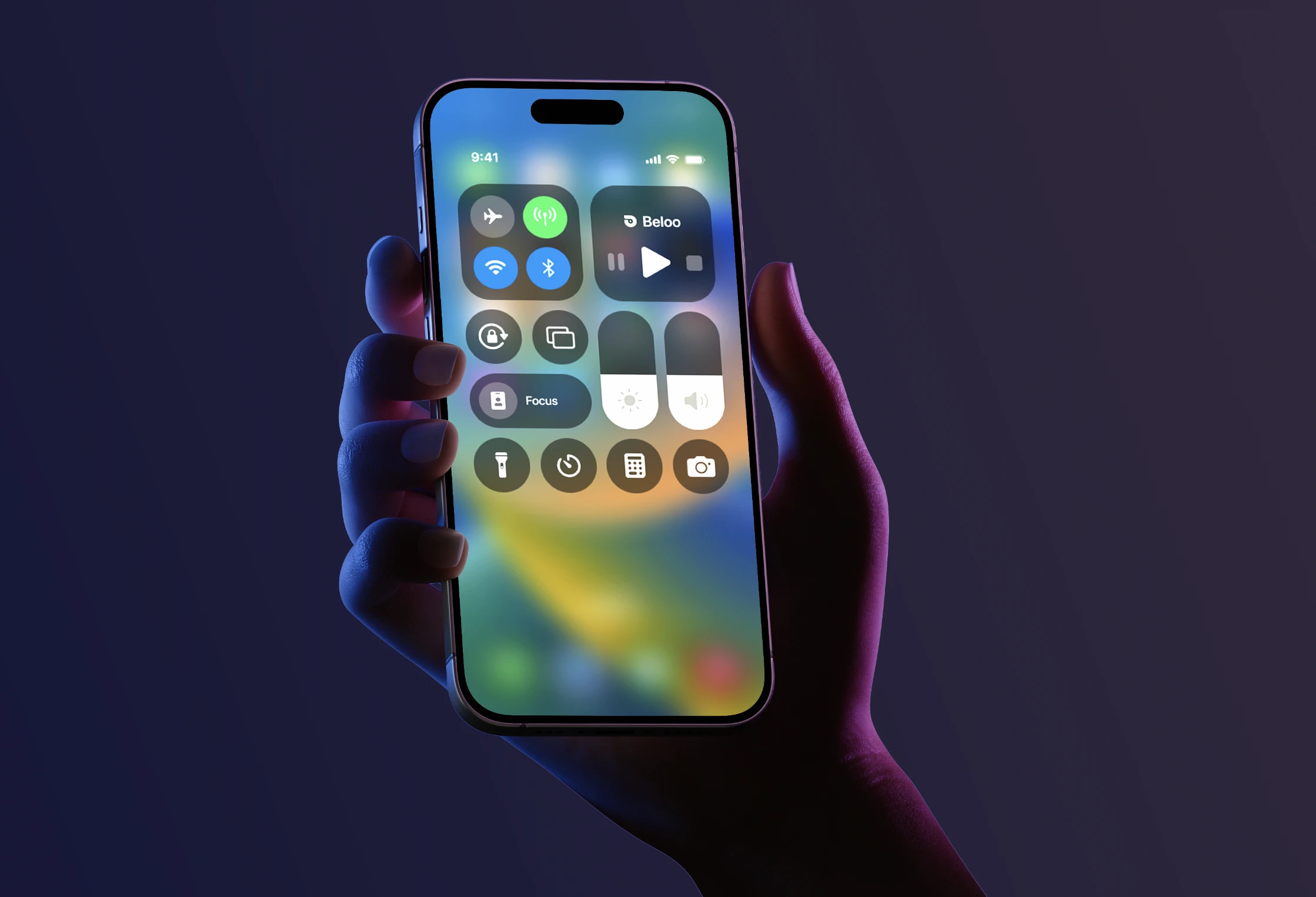 iOS Control Center
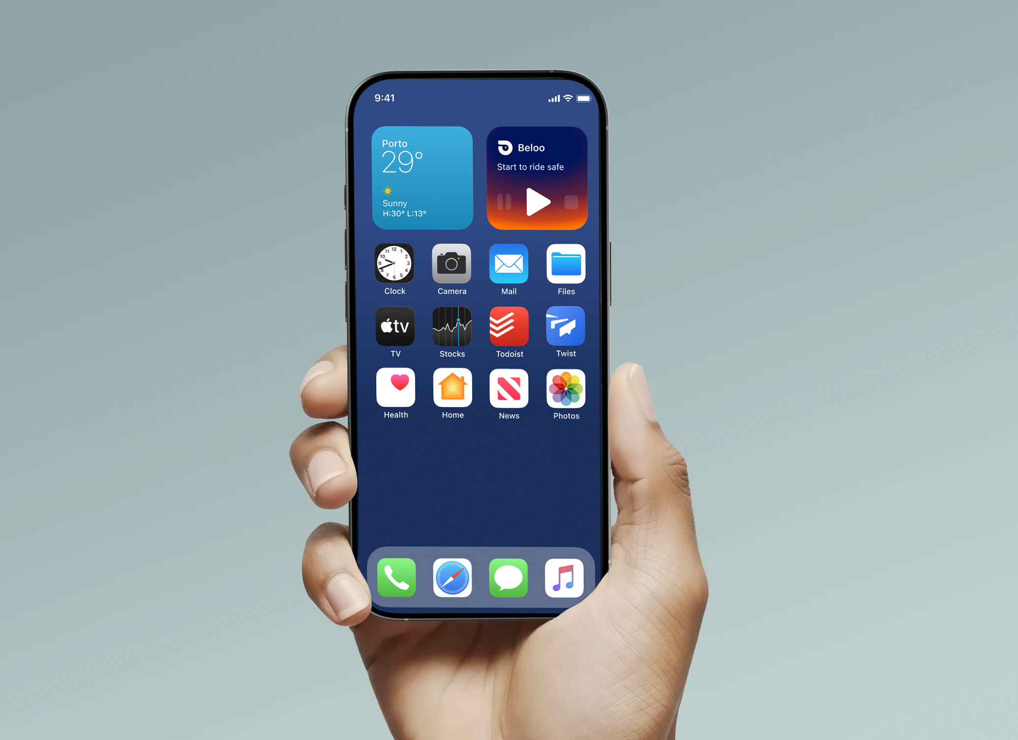 Home Screen Widget
Rewards & Gamification
Badges, social features, and partner rewards to increase daily engagement and retention. Making safety a habit through positive reinforcement.
Device Integration
Seamless integration with smartwatches and Garmin Edge devices — offering controls, notifications, and automatic start features directly from the handlebar.
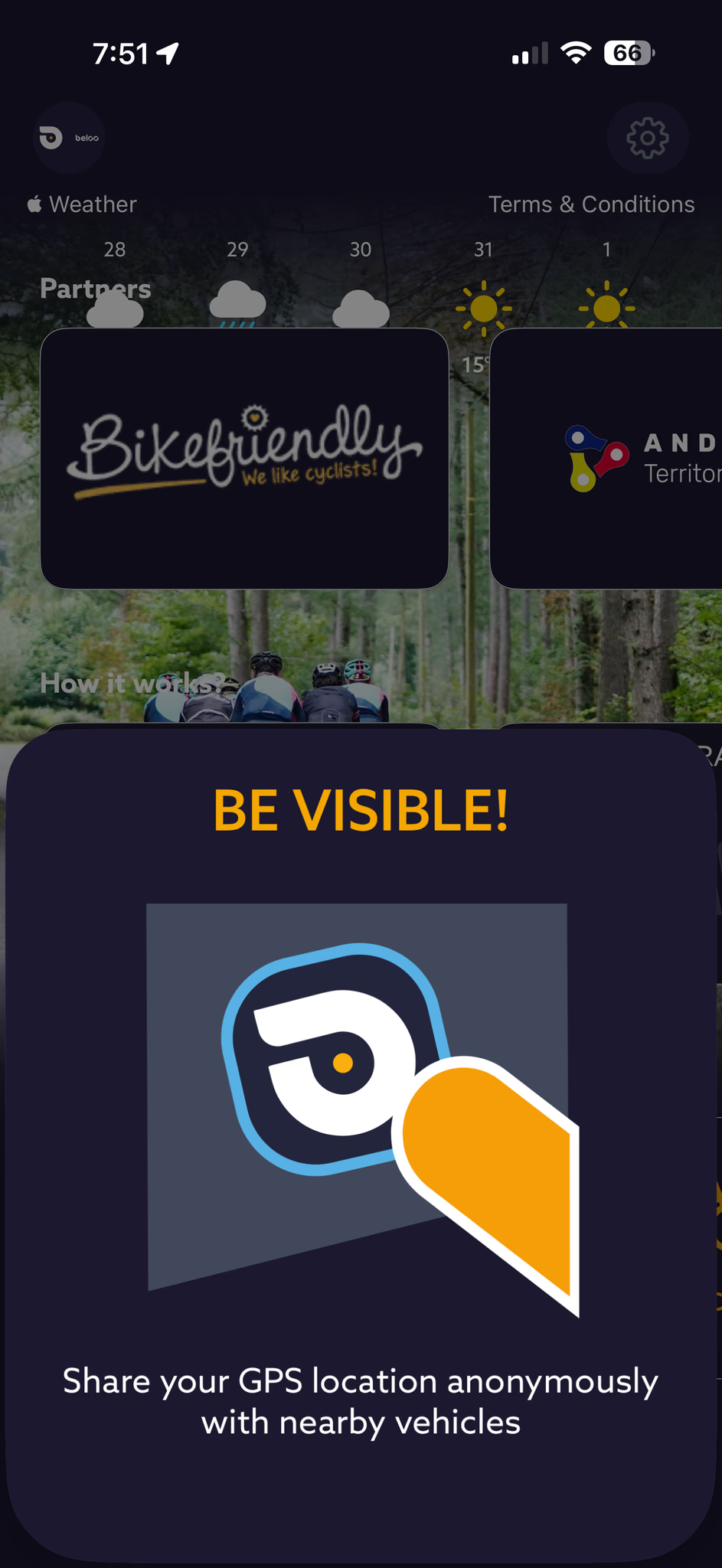
Social & Contextual Maps
Share live location via link, view other cyclists on the map, create or join riding events, and surface contextual POIs: water fountains, hills, repair workshops.
Feature — Structure
New Information Architecture
User testing revealed that riders couldn't find core features and didn't understand the app's primary purpose. The home screen was redesigned and merged directly into the active tracking view — eliminating the biggest source of confusion. Every category was reorganised around actual usage patterns discovered in the field.
beloo/
├── home/ (merged with tracking view)
│ ├── ai-sphere/ (live status indicator)
│ ├── safety functions/
│ │ ├── 112-emergency
│ │ ├── incident-report
│ │ └── roadside-insurance
│ ├── report-incidence-btn/
│ │
│ └── tracking controls (typewriter feedback)
│ ├── start-tracking
│ ├── pause-tracking
│ └── stop
│
├── social/
│ ├── share-location
│ ├── nearby-cyclists
│ ├── join-to-event-tracking
│ └── find events and groups
│
├──map-controls/
│ ├── points-of-interest ( fonts, workshosps, water fountains, hills...)
│ ├── friends-view
│ └── route-highlights ( sync with strava routes to improve your position broadcast)
│
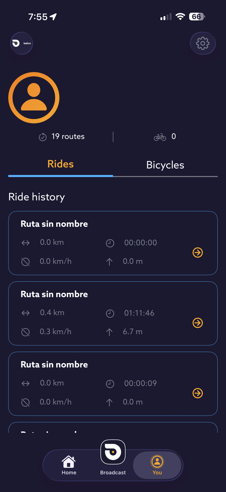
├── you/ (user profile and settings)
│ ├── stats
│ ├── badges-rewards/
│ │ ├── daily-streaks
│ │ ├── partner-discounts
│ │ └── achievements
│ │
│ ├── settings-and-preferences
│ ├── widgets-shortcuts
│ ├── notifications
│ ├── privacy
│ └── device-integration/
│ ├── garmin-edge
│ ├── apple-watch
│ └── android-wear
│
└── premium/
├── for-no-premium-users: promotion screen with benefits and CTA to subscribe
└── for-premium-users:
├── access-to-partners-discounds
├── inteligent-broadcast-auto-starting
├── manage-your-plan
├── roadside-insurance-details
├── excluseive-earining-points
└── premium-support
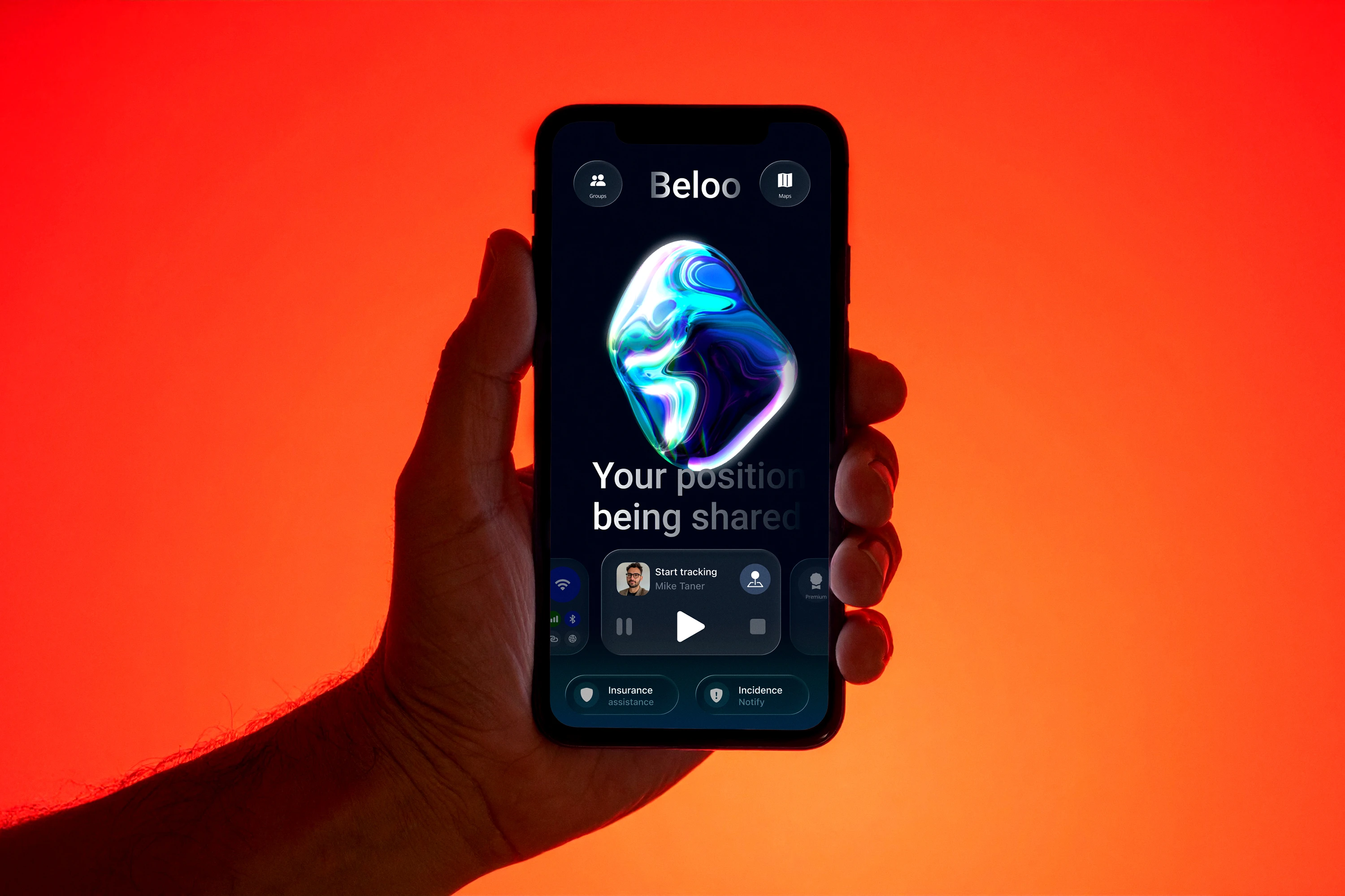
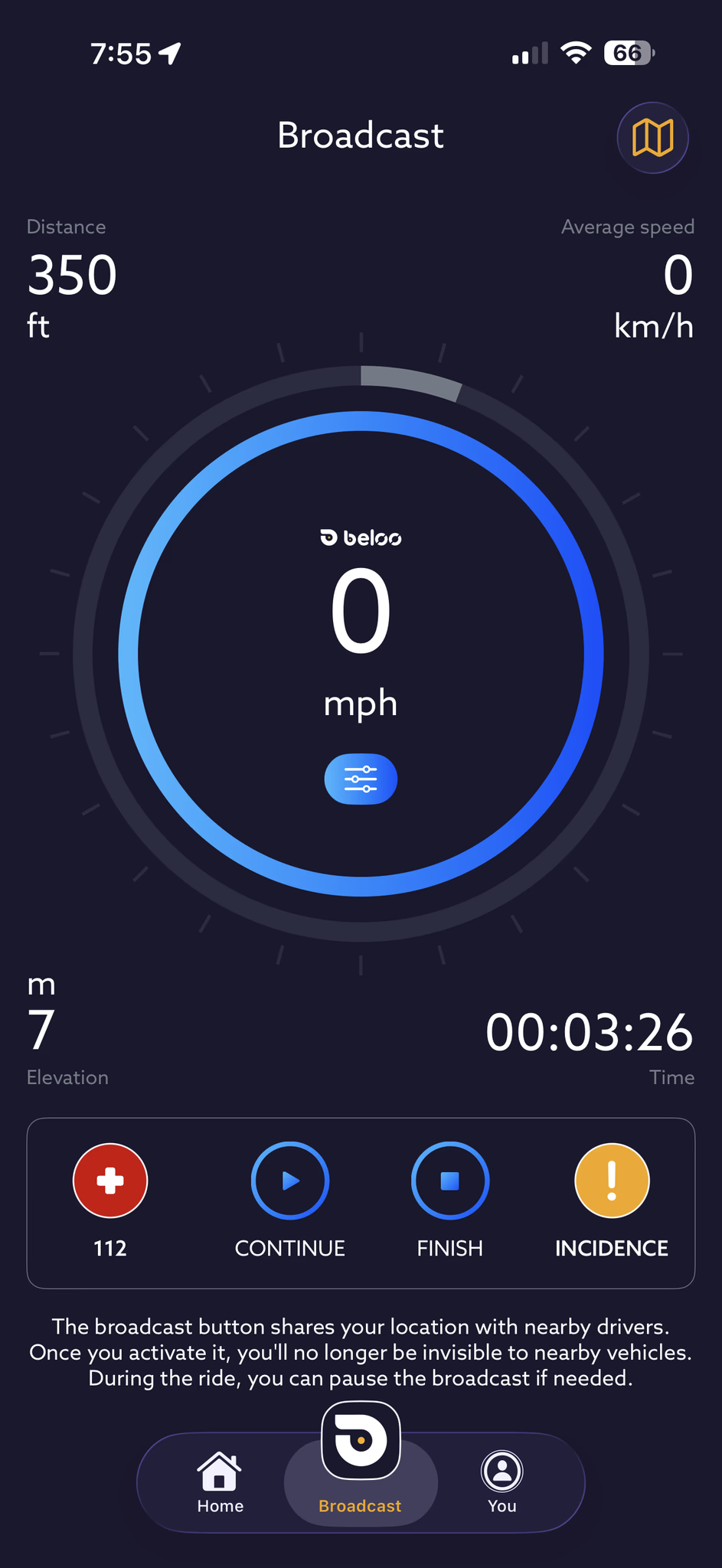
Feature — Main Screen
Easing Interaction, Safety & Refined UI Navigation
Research showed that cyclists couldn't find critical safety features when they needed them — buried deep in menus, requiring multiple taps while wearing gloves. The redesigned main screen brings incident reporting, roadside insurance, and the emergency 911 button to the first touch. A new color system and carousel nav make every action immediately clear.
-
Incident report — Persistent button to flag an incident instantly, triggering alerts to your contacts.
-
Emergency 911 — One-tap emergency call, always accessible from the home screen.
-
Roadside insurance — Premium coverage surfaced directly on the main screen — not hidden in settings.
-
Glove-friendly targets — All critical controls designed with large tap areas for use on the road.
-
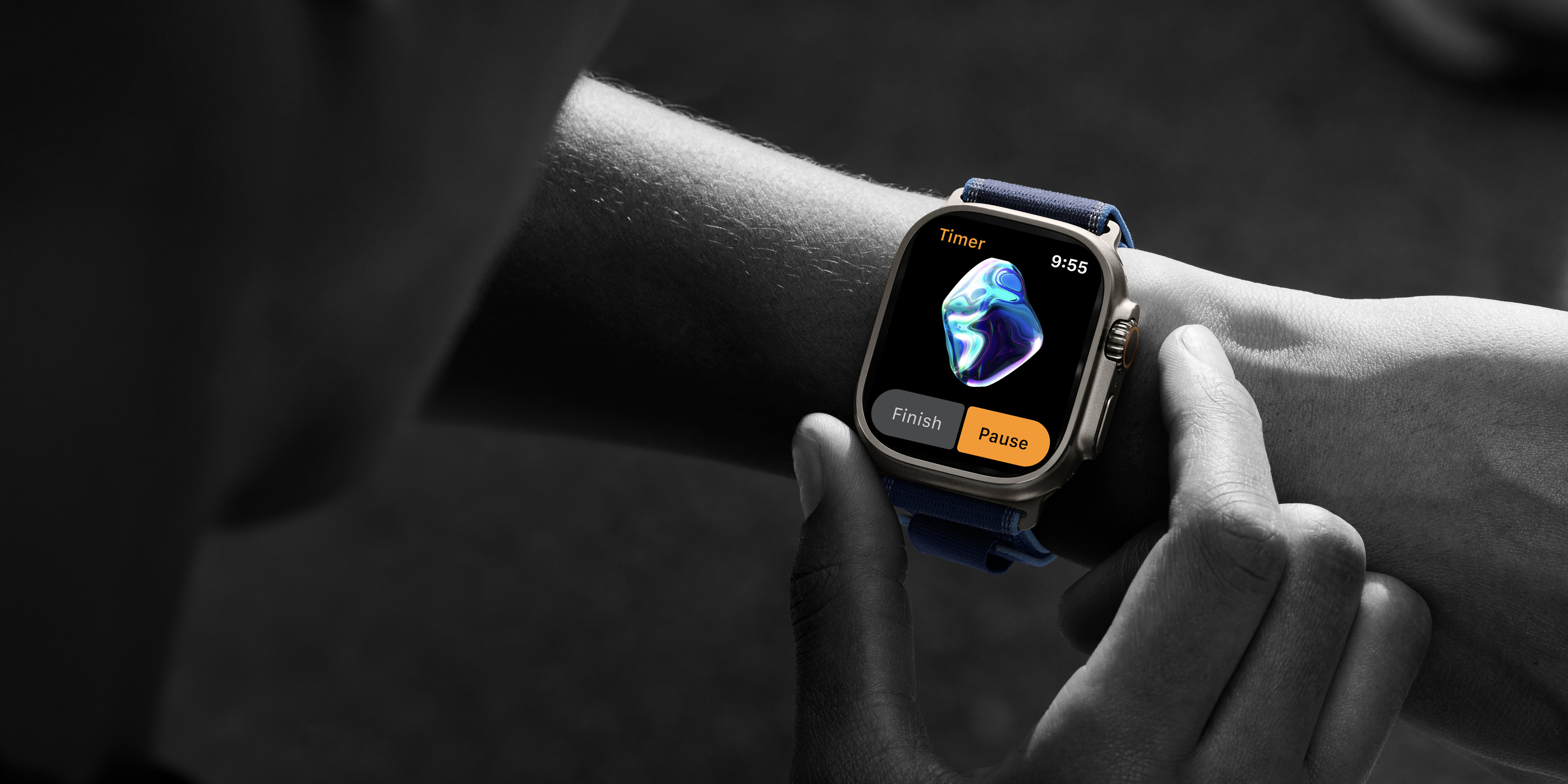
Color as system feedback — An orange sphere signals standby (not tracking); blue-green signals active broadcasting. The color of the AI element is the primary status indicator throughout the app.
-
Carousel nav — A swipeable menu gives quick access to all functions, with a cleaner top bar housing logo, social, and map controls.
3D Interactive AI (Spline)
A 3D interactive sphere acts as the primary UI element of the home screen. It humanizes the app and responds to the user's current state — standby or actively tracking. Its large surface also works as a touchable area for voice commands, critical for glove use in cold conditions. Below the sphere, the UI displays contextual feedback messages to guide the user in real time.
Waiting to track
An amber-orange pulsing sphere signals standby — the app is ready to broadcast your position when you start your ride.
Actively broadcasting
A calming blue-green color indicates that the user's position is actively being transmitted. Calm = broadcasting = safe.
Motion in Feedback Messages
Dynamic feedback messages communicate vital context to the user using typewriter animations. Depending on current conditions, the app greets the user and updates them on their status in real time.